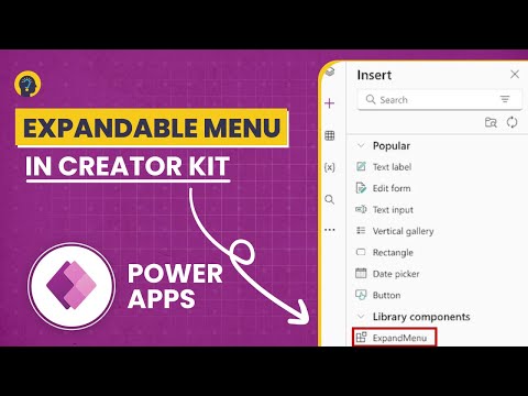
Table of Contents
- Key Takeaways
- Overview of Power Apps Creator Kit
- Exploring the Expandable Menu
- Setting Up the Expandable Menu Component
- Modifying Menu Settings
- Menu Item Management
- Setting Component Properties
- Visual Element Configuration
- Adding Menu Navigation
- Creating Screen Navigation Elements
- Setting Navigation Actions
- Fixing Navigation Problems
- Menu Setup and Testing
- Best Practices for Menu Customization
Creating an expandable menu in Power Apps adds a professional touch to application navigation. The Power Apps Creator Kit provides ready-made components that make this process simple and efficient. These components help developers build dynamic navigation menus without writing complex code from scratch.
The expandable menu component offers flexibility in design and functionality. Users can customize menu items, icons, and tooltips to match their application needs. The menu smoothly expands and collapses, providing an intuitive way for users to move between different screens.
Key Takeaways
- The expandable menu component streamlines navigation between screens in Power Apps
- Developers can customize menu items with unique icons, labels, and tooltips
- The component supports smooth transitions and default expansion settings for better user experience
Overview of Power Apps Creator Kit
The Power Apps Creator Kit provides pre-built components that streamline app development. One notable component is the expandable menu, which adds navigation functionality to Power Apps.
The expandable menu component can be added through the “Get More Components” section in Power Apps. Developers can customize its appearance and behavior through properties like height, default expansion state, and navigation settings.
Menu items within the component are fully customizable. Developers can add, remove, or modify items by adjusting the items property table. Each menu item can have a unique icon, label, and tooltip.
The component supports dynamic navigation between screens. When users click menu items, the app can switch to different screens based on the selected option. This creates a smooth navigation experience.
Key Properties:
- Default expansion value
- Navigation enable/disable
- Item selection
- Custom icons
- Screen navigation triggers
Navigation can be configured through the OnSelect property of the expandable menu. This allows developers to set up specific screen transitions for each menu item selection.
Multiple expandable menus can exist across different screens in an app. Each instance needs unique identifiers and navigation settings to function properly.
The menu supports both collapsed and expanded states. Users can toggle between these states by clicking the menu component during runtime.
Exploring the Expandable Menu
A power app creator kit offers expandable menu components for easy menu creation. The menu expands and collapses with a simple click, showing different options for navigation.
The expandable menu setup starts with installing the power app creator kit. After installation, users access it through the Insert > Get More Components menu. The library component contains the expandable menu option for import.
The menu’s default settings need adjustment for proper function. Key settings include:
- Default expansion value: On
- Navigation enabled: On
- Selection property: True
To customize menu items, developers can modify the items property table. Each menu item needs:
- An icon (like home or database)
- A label name
- A tooltip message
The navigation between screens requires proper coding in the OnSelect property. A simple if-then statement checks which menu item gets clicked and directs to the right screen. The code must match the exact menu label names for proper function.
Each screen needs its own expandable menu component with unique names like expandableMenu1, expandableMenu2. The code references must match these specific names for navigation to work correctly.
The menu stays consistent across screens through copying and pasting the component. Each screen’s menu needs its own OnSelect property code to handle navigation properly.
Tips for smooth menu operation:
- Remove default screen references
- Match component names carefully
- Keep label names consistent
- Test navigation between all screens
Setting Up the Expandable Menu Component
Start by installing the Power Apps Creator Kit from the library. After installation, open the app and create two screens to build the menu structure.
Navigate to the Insert tab and select “Get More Components.” Find the Expandable Menu component in the library and click Import to add it to the application.
The menu appears with default settings that need adjustment. Set these key properties:
- Default Expansion Value: On
- Navigation: Enabled
- Selection: True
By default, the menu includes 4 items. To customize them:
- Select the menu
- Open the Items property
- Edit the table entries
- Add or remove menu items as needed
The menu supports icons, labels, and tooltips for each entry. Some useful icons include:
- Home icon
- Database icon
- Plus icon
Set up navigation between screens by adding an OnSelect property to the menu. Use If/Then statements to check which menu item was clicked and navigate to the proper screen.
Each screen needs its own copy of the menu component. Copy and paste the menu, then update the references for each screen. Make sure to:
- Give each menu a unique name
- Update navigation code for each copy
- Set proper selection properties
Add labels to each screen to identify them:
- Screen 1: Home
- Screen 2: Database
- Screen 3: New
Remove any automatic screen navigation settings from the menu items to prevent unwanted screen changes. Test the menu by clicking different options to ensure proper navigation between screens.
Modifying Menu Settings
Menu Item Management
The expandable menu allows adding or removing items through the Items property. Click the menu component and locate the Items field in the properties panel. Each menu item exists in a table format. Delete unwanted entries by removing their corresponding table rows. Add new items by copying existing rows and pasting them below. Take care not to modify any core code structure or parentheses when making changes.
Setting Component Properties
The expandable menu includes several adjustable settings. Toggle the Default Expansion Value to control whether the menu starts expanded or collapsed. Set Is Navigation Enabled to “On” to allow menu item selection. The Expand Selection property must be set to “true” to enable clicking menu options.
Visual Element Configuration
Menu items can display custom text and icons. Edit the Label field to change item names. The Icon field accepts standard Power Apps icons like “Home” or “Database”. Each item includes a Tooltip field for hover text. These visual elements help users identify menu options:
Example Configuration:
- Label: “Home”
- Icon: Home icon
- Tooltip: “Home Screen”
Menu items require unique names to work correctly across multiple screens.
Adding Menu Navigation
Creating Screen Navigation Elements
The expandable menu component from the Power Apps Creator Kit needs proper setup on each screen. Add the component through the “Get More Components” section in the insert menu. Set the default expansion value and navigation settings to “On” in the properties panel. Enable selection by setting the selection property to “true.”
The menu settings require proper configuration in the Items property. Remove or modify default menu items in the table. Icons help users identify navigation options. Common choices include:
- Home icon for main screen
- Database icon for data views
- Plus icon for new items
Setting Navigation Actions
Navigation between screens happens through button select actions. Each expandable menu needs specific code in the OnSelect property. The code checks which menu item gets clicked and directs users to the right screen.
Key steps for button actions:
- Check selected menu item label
- Add If/Then statements for each navigation path
- Use proper screen names in Navigate functions
Fixing Navigation Problems
Common navigation issues have simple fixes:
- Menu keeps returning to home: Remove “Screen = App.ActiveScreen” from Items property
- Buttons not working: Verify expandable menu control names match the code
- Wrong screen appears: Check If/Then conditions in OnSelect properties
Each screen needs its own button select code. Copy and update the control names to match each screen’s menu component.
Menu Setup and Testing
Menu setup begins with accessing the Creator Kit components. Opening the insert menu reveals the “Get More Components” option. After importing the expandable menu component from the library, it appears in the current application.
Users can control the menu height and expansion settings. The default expansion value and navigation settings need activation through the properties window. Setting the selection property to “true” enables menu item selection.
The default menu includes four items: PowerApps, Power BI, Power Automate, and Dataverse. These can be modified by editing the items property table. Icons, labels, and tooltips are all customizable elements.
Menu navigation requires proper coding in the OnSelect property. A simple if-then statement checks which menu item was clicked. The code structure links each menu option to its target screen.
Screen copying helps maintain consistency. Each screen needs its own menu instance with unique reference names like “expandableMenu_1” and “expandableMenu_2”.
Key navigation settings:
- Default expansion state
- Navigation enablement
- Selection properties
- Button actions
Important: Remove any screen references in the items property to prevent unwanted screen switching. Each menu instance needs its own OnSelect code to handle navigation properly.
Testing involves:
- Clicking each menu item
- Verifying correct screen navigation
- Checking expansion/collapse behavior
- Confirming tooltip displays
The menu setup requires separate configurations for each screen. This ensures proper navigation between home, database, and new screens while maintaining menu functionality throughout the app.
Best Practices for Menu Customization
Power Apps Creator Kit offers a flexible expandable menu component that enhances navigation within applications. The menu component supports multiple customization options to meet specific design needs.
Adding the menu starts with importing it through the “Get More Components” section in Power Apps. Select the expandable menu from the Creator Kit library and place it on the desired screen.
Key Menu Settings:
- Set Default Expansion Value to “On” for expanded view on launch
- Enable Navigation in properties
- Set Selection property to “True” for clickable menu items
The menu items can be modified through the Items property. Developers can add, remove, or edit entries in the table format. Each menu item supports these customizable elements:
- Icons (home, database, plus, etc.)
- Labels
- Tooltips
Navigation Setup:
- Add OnSelect property code to each menu
- Link menu items to specific screens
- Ensure unique control names per screen
To prevent screen flicker, remove any “Screen = App.ActiveScreen” references from the Items property. This creates smoother transitions between screens.
For multi-screen applications, copy the menu component to each screen. Adjust the control names and OnSelect properties to maintain proper navigation flow between screens.
Important Properties:
- Items: Controls menu entries and icons
- OnSelect: Handles navigation logic
- DefaultExpansion: Sets initial menu state
- NavigationEnabled: Controls click functionality
The expandable menu works best when placed consistently across all screens. This creates a unified navigation experience throughout the application.