
Table of Contents
What are Map Charts?
Map Charts in Power BI are the perfect choice for representing geographical data in a visualization format. Power BI is an effective Business Intelligence tool that transforms raw data into meaningful, interactive reports and dashboards. Among the two types of visuals in Power BI—Default Visuals and Custom Visuals—Map Charts belong to the default visuals. In this blog, we will explore the different types of map charts available in Power BI.
Why are Map Charts used?
Map charts are used to represent the geographical data :
- It provides the visual with location-based information.
- Helps to identify trends, analysis and outliers across different regions.
- Enhances decision-making with geographical insights.
Types of Map Charts in Power BI
Power BI has various types of map charts such as :
Basic Map Chart
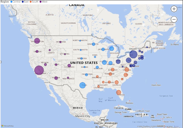
Plots data points on a geographical map based on latitude and longitude, this chart is more helpful to point out individual states and cities with respect to Sales, Profit, Quantity.
Filled Map Chart
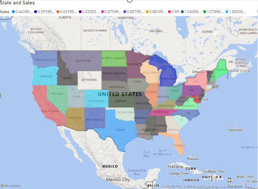
Highlights geographical regions like countries, states, or zip codes with color-coded data. Here, the entire state or country will be colour coded with respective of region or any other legend information.
Shape Map
It displays the visual with the specified shape and region, useful for visualizing non-standard geographical areas. In this visual accessing the complete world map is not possible.
ArcGIS Maps for Power BI
It has the advanced mapping features given by Esri, which provides more customization and data layering options.
Azure Maps
This map provides real-time geospatial insights with better integration for time-based or route-based data visualization.
Be ready with the Data for Map Charts, such as
Geographical Fields – Such as country, state, city, or latitude and longitude.
Unique Identifiers – Ensure that your location data is explicit to avoid absence.
Data Format – Clean and structured data to drag in data fields.
Step-by-Step Process of creating a Basic Map Chart
First Step: Load Your Data
1. Open Power BI Desktop.
2. Click on Get Data and import your data.
3. Make sure that your data includes geographical fields.
Second Step: Add a Map Visualization
1. Go to the Visualizations pane.
2. Choose the Map chart..
3. Get your geographical field (e.g., State or City) into the Location field.
4. Drag a numerical value (e.g., Sales or Profit) into the Bubble Size to represent data points.
Third Step: Format Your Map Chart
Use the Formatting Section to :
1. Set the map styles.
2. Enable/disable map controls like zoom.
3. Set data colours and bubble sizes.
Example of Basic Map Chart
Step-by-Step Process of creating a Filled Map Chart
First Step: Select the Filled Map Option
- In the Visualizations section, select the Filled Map chart.
Second Step: Add Data Fields
- Get your geographical field (e.g., State or Country) to the Location.
- Drag your data value (e.g., Sales, Revenue, Profit) to the Values.
Third Step: Customize the Visualization
- Adjust colour in the Format Pane to represent data distribution effectively.
Conclusion
The family of Map charts which represents geographical data in Power BI are a powerful way to visualize geographical data. By knowing the multiple types of map charts and following the steps described above, can create impactful and meaningful visualizations for your reports and dashboards.